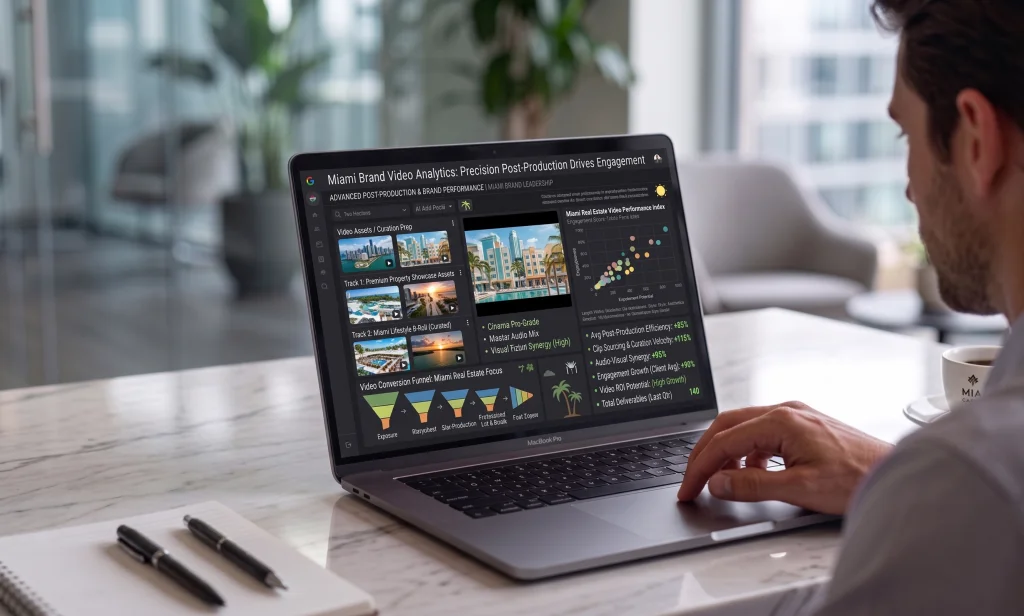
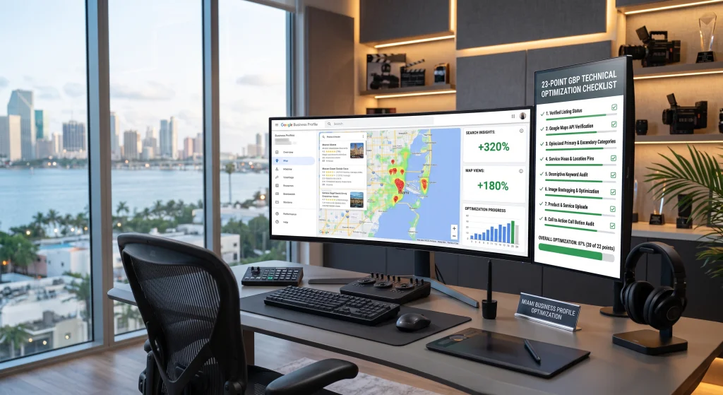
If your website was designed on a 27-inch monitor and simply “shrunk” to fit a smartphone, you are actively driving high-ticket customers to your competitors.
Walk into any coffee shop in Brickell, look around a waiting room in Coral Gables, or glance at the passengers in an Uber on I-95. What is everyone doing? They are looking at their phones.
In Miami’s hyper-connected, fast-paced economy, a large share of local and B2B search now happens on a phone. High-level executives, medical patients, and enterprise buyers are not sitting at desktop computers to research their next big investment; they are doing it on the go, from the palm of their hands.
Despite this undeniable reality, the vast majority of traditional marketing agencies still design websites backward. They build a stunning, complex desktop site first, and then rely on automated “mobile responsiveness” to haphazardly stack elements for a phone screen.
At Cr3ative Growth, we recognize that designing for desktop first in 2026 is a massive strategic error. Here is why Mobile-First Design is the only digital infrastructure that guarantees conversions in South Florida.
1. “Mobile-Responsive” vs. “Mobile-First”: The Fatal Difference
There is a dangerous misconception that if your website automatically resizes to fit a phone screen, it is “mobile-friendly.” This is entirely false.
-
Mobile-Responsive: The website was designed for a large screen. When viewed on a phone, the massive images compress, the text becomes a towering wall of words, and the user has to scroll endlessly to find the “Contact” button. It technically fits, but the user experience is miserable.
-
Mobile-First Design: The website is engineered entirely around the “Thumb Zone.” The layout, the navigation, and the conversion architecture are built specifically for how a human hand interacts with a 6-inch touchscreen. Desktop is treated as the secondary experience, not the primary one.
In B2B and healthcare marketing, friction kills conversions. If a prospect has to use two hands to pinch, zoom, or navigate a clumsy dropdown menu just to book a consultation, they will bounce instantly.
2. The “Speed to Lead” Mobile Penalty
Mobile users are inherently impatient. When someone searches for a “Miami corporate logistics partner” or a “specialized medical clinic near me,” they expect an immediate digital response.
If your desktop site is loaded with heavy 4K background videos and bloated code, it might load fine on an office Wi-Fi connection. But when a user tries to load that same site on a 5G mobile connection, it takes five or six seconds to render.
Google’s algorithm severely penalizes slow mobile load times. Since Google officially shifted to Mobile-First Indexing, the search engine evaluates and ranks your website based exclusively on its mobile version. If your mobile site is slow, clunky, or hard to read, your desktop site’s SEO ranking will plummet alongside it, effectively wiping your brand off the first page of search results.
3. High-Conversion Mobile Architecture
To capture Miami’s mobile traffic, your digital infrastructure must be engineered for instant gratification. A true mobile-first smart site incorporates intelligent conversion architecture:
-
Sticky CTAs: The primary Call to Action (e.g., “Book a Call,” “Call Now,” “Get a Quote”) should remain locked at the bottom or top of the screen as the user scrolls. The prospect should never have to search for a way to give you money.
-
Click-to-Call Functionality: If you operate a local B2B service or medical practice, your phone number must be a native, clickable link. Making a user copy and paste a phone number into their dialer is an unnecessary point of friction.
-
Eliminating Static Forms: Typing out a 10-field contact form on a mobile keyboard is a frustrating experience. Mobile-first design replaces these with AI-powered conversational chatbots or streamlined, multi-step capture sequences (one question per screen) that feel native to a smartphone interface.
-
Thumb-Friendly Navigation: Essential links must be positioned at the bottom of the screen (within the natural arc of the user’s thumb) rather than hidden inside a tiny “hamburger” menu at the top left corner.
The Miami Advantage: Capture the Traffic That Matters
Miami is an “on-the-go” economy. Deals are researched in transit, and decisions are made on smartphones. If your digital presence doesn’t respect the mobile user’s time, you are silently leaking revenue every single day.
You do not need a website that just looks pretty on an iMac. You need an aggressive, fast-loading, mobile-first conversion engine.
Stop losing mobile leads to bad design.
At Cr3ative Growth, we build elite, mobile-first digital ecosystems for Miami’s most ambitious brands. From AI-powered load optimizations to thumb-driven UX, we engineer websites that turn mobile traffic into measurable B2B revenue.
👉 Click here to schedule a free Mobile Conversion Audit with our team today.