Aesthetics don’t pay the bills. If your site is a stunning digital brochure with a terrible user experience, you are bleeding high-ticket leads to your competitors.
Miami is a city obsessed with aesthetics. From the skyline of Brickell to the storefronts of the Design District, looks matter. Unfortunately, thousands of South Florida businesses have applied this exact same philosophy to their web design.
They hire a boutique design agency, spend tens of thousands of dollars on custom animations, embed massive 4K drone videos of the ocean on their homepage, and launch the site. It looks like a masterpiece.
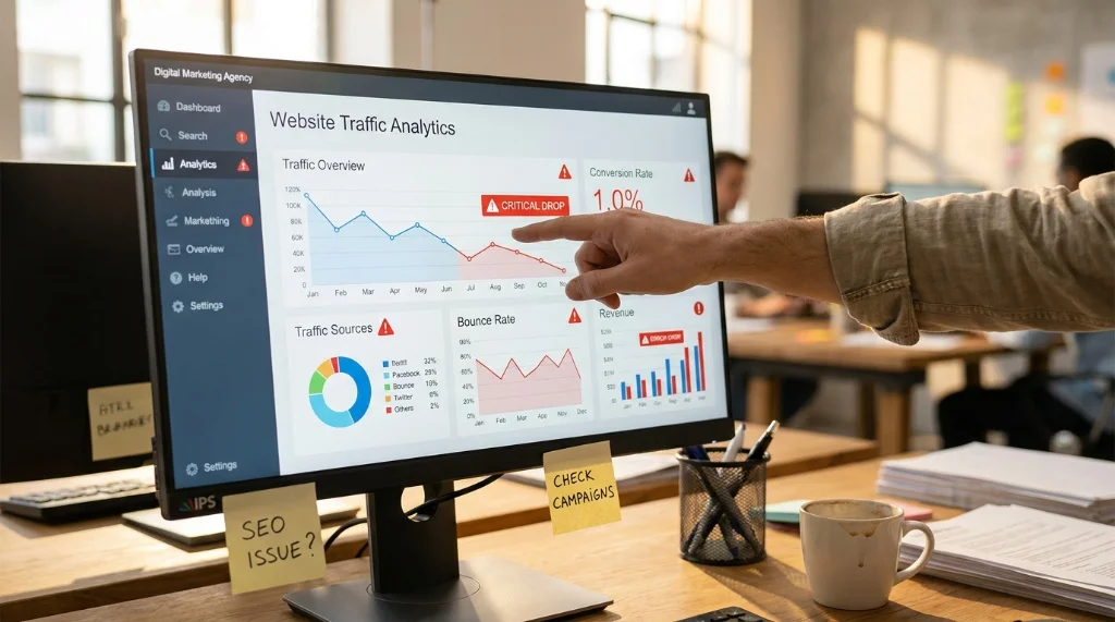
But three months later, the analytics reveal a brutal reality: traffic is bouncing, the phone isn’t ringing, and the website is generating zero revenue.
A beautiful website that doesn’t convert is just an expensive piece of digital art. At Cr3ative Growth, we audit dozens of B2B and healthcare websites across Miami every month. We consistently find that brands are sacrificing performance, psychology, and conversion architecture at the altar of “looking cool.”
If your website is visually stunning but failing to generate qualified leads, here are the three core reasons why—and how to fix it.
1. The “Digital Art” Trap (Form Over Function)
Many designers build websites to win design awards, not to acquire customers. They implement complex scroll animations, hidden navigation menus, and heavy visual assets that confuse the user and destroy the site’s loading speed.
In the world of B2B and performance marketing, friction is the enemy of conversion.
-
The Speed Penalty: If that beautiful 4K background video causes your site to load in 6 seconds instead of 1.5 seconds, you have already lost 50% of your traffic. Furthermore, Google’s algorithm will actively penalize your SEO ranking for poor Core Web Vitals.
-
Cognitive Overload: When a high-ticket prospect lands on your site, they want to solve a problem quickly. If they have to hover over ambiguous icons to figure out where your “Services” page is, they will simply leave.
The Fix: Beauty and speed must coexist. Use AI-driven technical optimization to compress assets. Implement intuitive, frictionless UI/UX design where the path to the checkout or booking calendar is completely unobstructed.
2. Vague, Ego-Driven Copywriting
You have exactly three seconds to tell a visitor what you do, who you do it for, and why they should care.
Take a look at your current hero headline (the big text at the very top of your homepage). Does it say something like: “Empowering the Future of Synergistic Innovation”?
That means absolutely nothing. B2B buyers and medical patients do not care about your corporate jargon. They care about their own pain points. If your website focuses on how “innovative” your company is rather than how you solve the user’s specific problem, your conversion rate will flatline.
The Fix: Swap “creative” writing for Conversion Copywriting. Your headline needs to be ruthlessly clear. Instead of “Empowering Logistics,” use “Next-Day Cold-Chain Medical Shipping in South Florida.” Tell the user exactly what they get. We use AI data analysis to reverse-engineer exactly what your target audience is searching for, ensuring your copy aligns perfectly with their psychological intent.
3. High-Friction Conversion Pathways
Imagine walking into a luxury Miami retail store, wanting to buy a product, but there are no cashiers, no signs pointing to the register, and you have to fill out a 15-page questionnaire before someone will talk to you. You would walk out.
This is exactly what you are doing to your digital traffic when you use outdated conversion pathways.
-
Burying the “Call to Action” (CTA) at the very bottom of the page.
-
Using a static “Contact Us” form that asks for 10 different fields of information (Name, Phone, Email, Company, Budget, Message, etc.). Every field you add to a form drops your conversion rate by double digits.
The Fix: Implement intelligent conversion architecture. Replace static forms with AI-powered smart chat agents that can qualify leads in real-time. Use dynamic CTAs that offer immediate value (like “Book a Free Audit” via an integrated Calendly link) rather than a passive “Submit.”
The Miami Advantage: Build a Revenue-Generating Asset
In South Florida’s hyper-competitive market, your competitors are just one click away. You cannot afford to treat your website like a passive digital brochure.
Your website is the foundational infrastructure of your entire digital marketing ecosystem. If your Meta Ads and SEO strategies are driving traffic to a site that looks beautiful but acts like a maze, you are burning your marketing budget.
It is time to merge elite art direction with data-driven conversion psychology.
Stop losing leads to bad UX.
At Cr3ative Growth, we build high-performance digital ecosystems for Miami’s most ambitious B2B and healthcare brands. We don’t just design websites that look stunning; we engineer smart sites built specifically to capture, qualify, and convert your ideal customers.